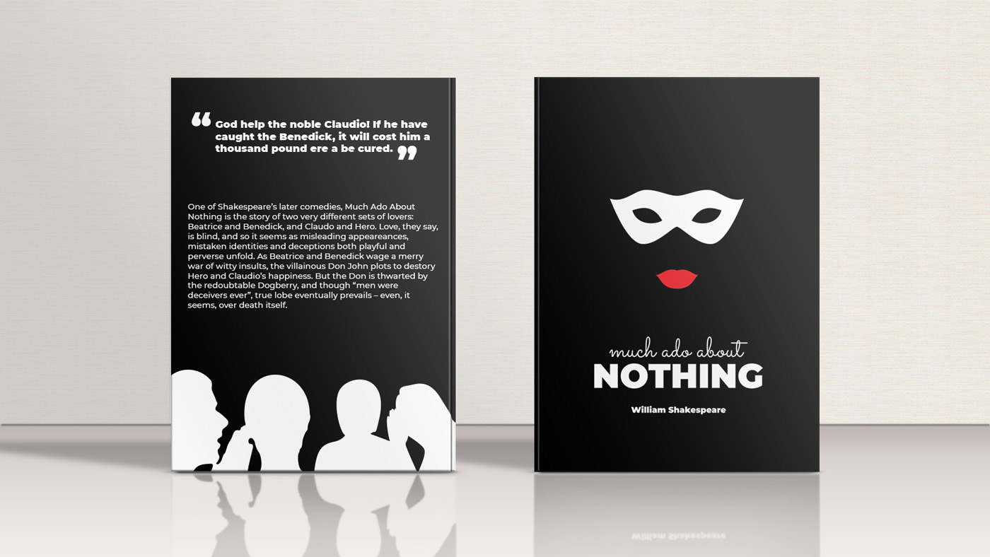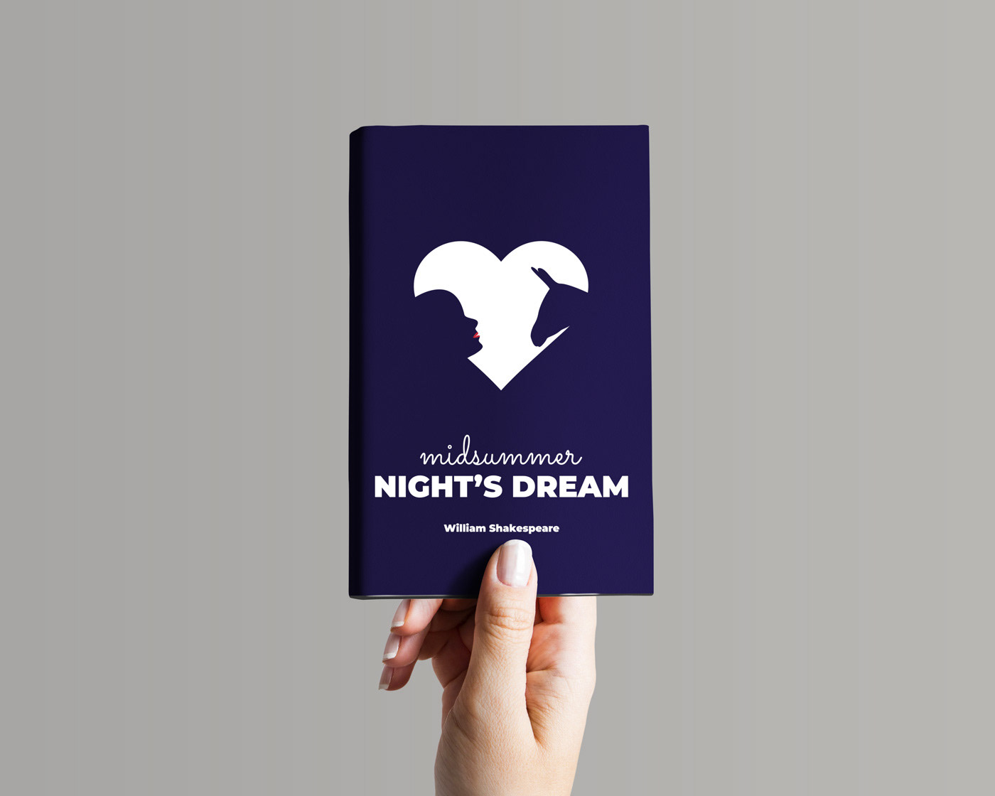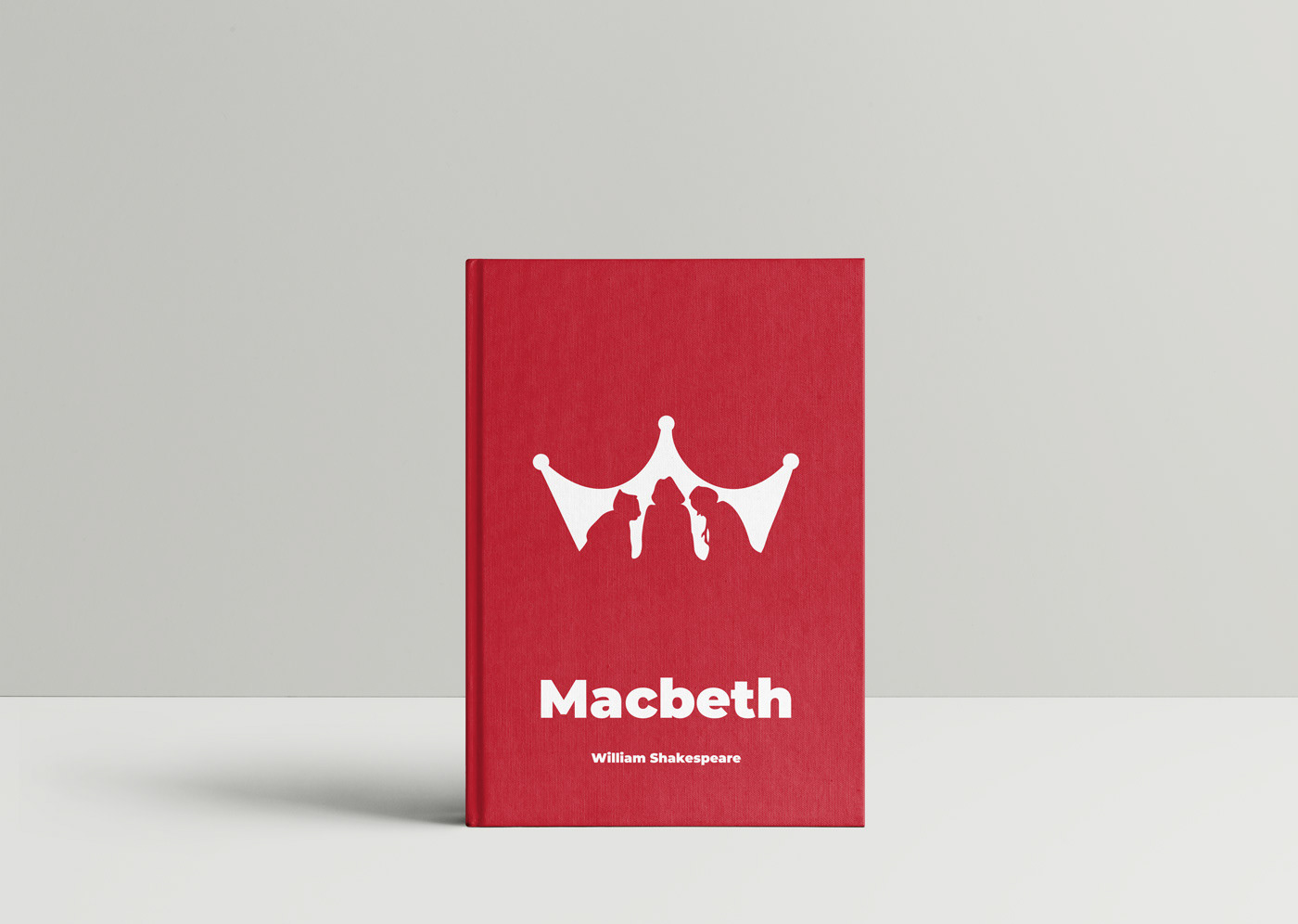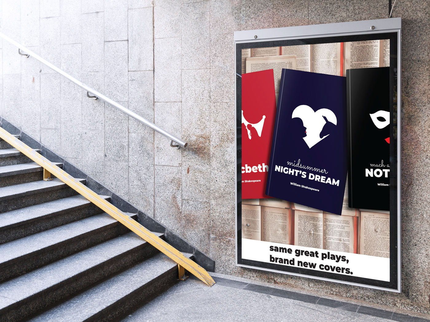
The goal of re-designing Shakespare play covers is to bring a more modern and minimalist look to them. Each cover is designed using negative space to demonstrate standout characters, themes, or moments from each play. The colours used are very bold the covers will stand out from the existing Shakespeare covers.
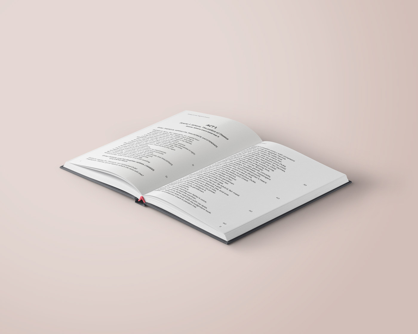
The inside pages was designed for students as they are required to know the line numbers for citations. The lines are numbered by increments of 10 to increase clarity. The pages uses a very clean and easy to read typeface that matches the cover.
Challenge: Keeping a cohesive theme, but still show a stand out theme from each play.
Time: 4 days
Program used: Adobe Illustrator, Adobe Indesign