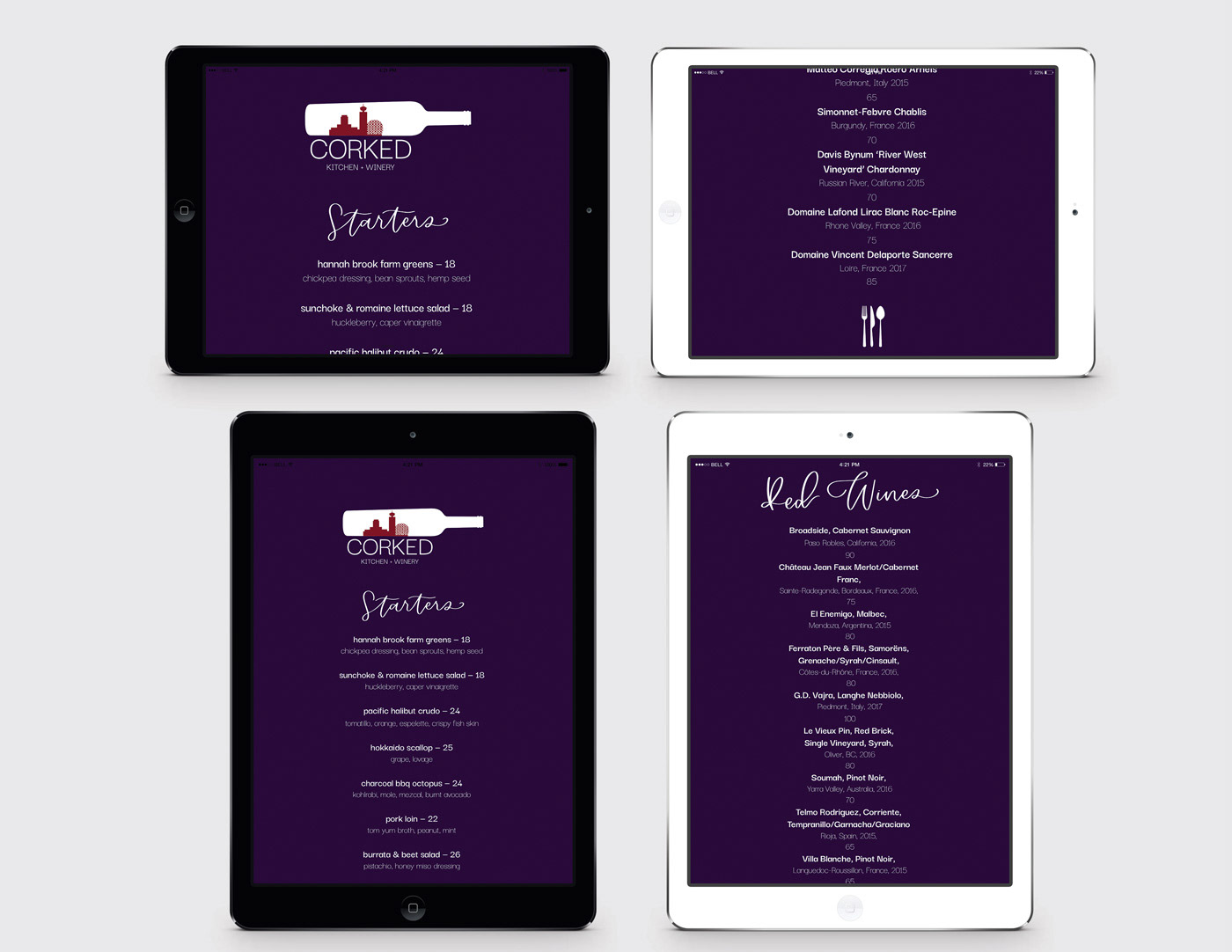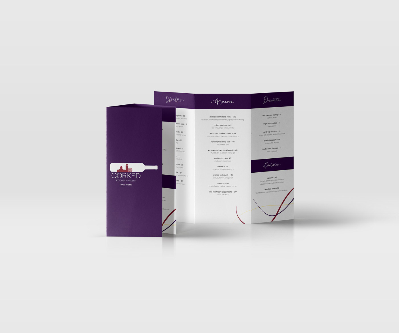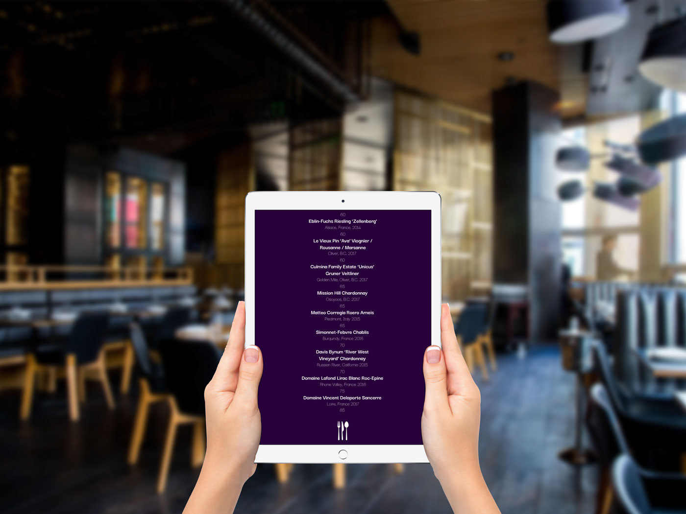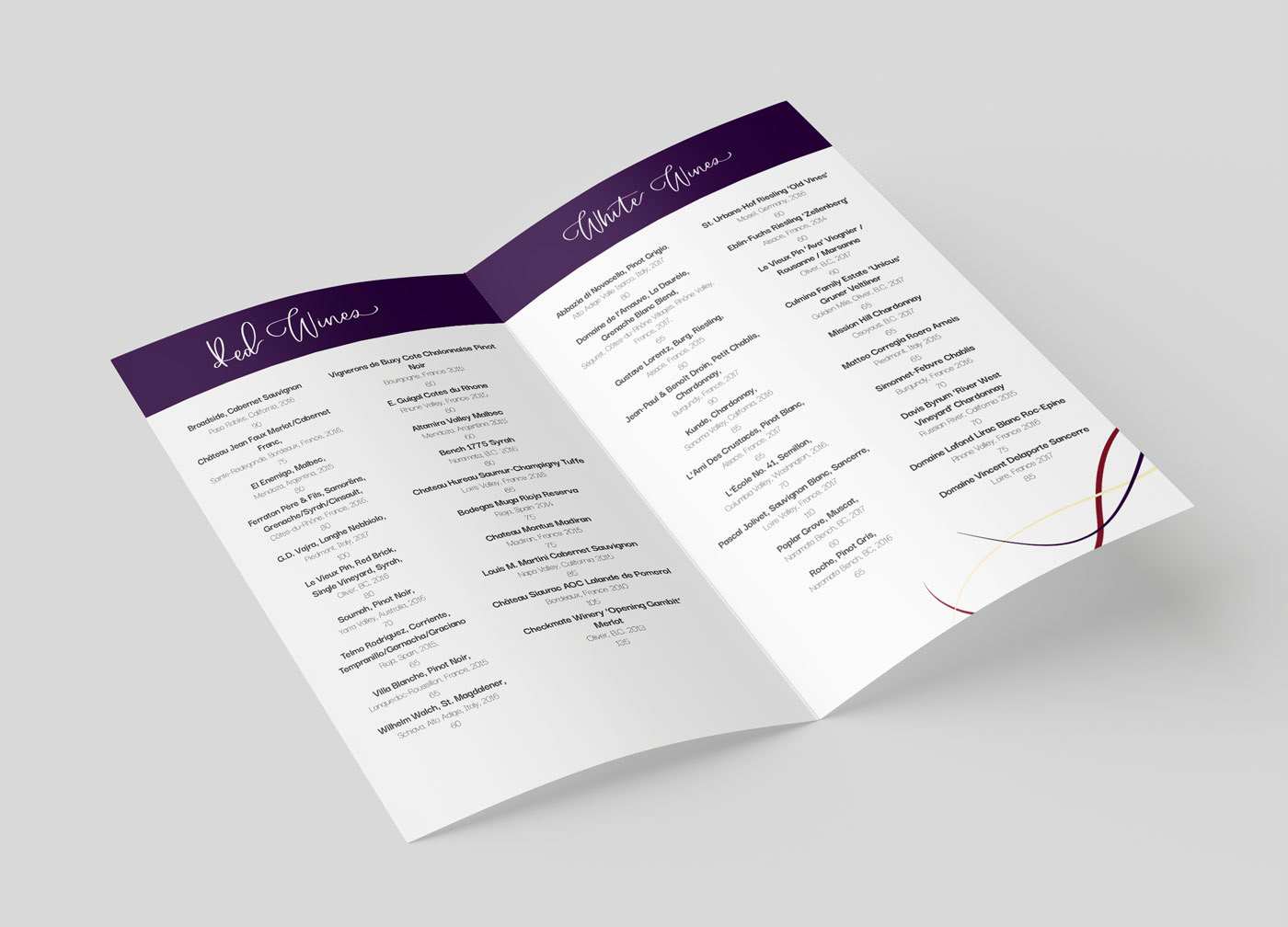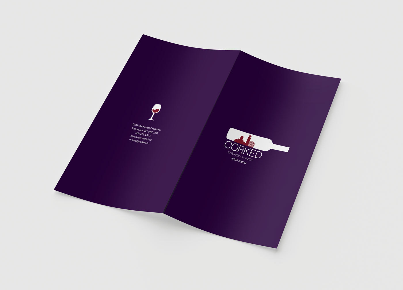
Corked is an upscale restaurant and winery in Vancouver. The logo is very simplified illustration of Vancouver inside. The layout out the menu is very clean, minimal, and with a lot of negative space. The headers for both the menus are handwritten, because it gives the menu an elegant and authentic touch. I also created all the graphic elements on the menu. The menu is designed with a goal to not overwhelm the guests. As the restaurant has different wines on rotation, a separate bi-fold menu was created to keep the layouts cleans and simple. Different wines are represented by their colour in a graphic that mimics wine being poured out.
Challenge: Being able to balance the deep purple with the white and graphics without interfering with the text.
Time: 3 days
Platform: Print and iPad
Program used: Adobe Indesign, Adobe Illustrator, Procreate + Apple Pencil